Locket Concept: Strengthening Friendships with Meaningful Threads
Capturing Moments and Initiating Conversations
Duration
Role
Product Designer
March - May 2024
Context
What is Locket?
Prototype Overview
The Problem
“I love being able to share a small part of my day with my friends.”
- NZ
“I feel comfortable posting on Locket.”
- SS
. . . and some mixed trends
Key Insights
Team
Just myself :)
Tools
Figma
You open your phone and a widget on your home screen catches your eye. It’s your daily update from your friends on Locket. Let’s see… one friend is catching a flight to Korea while another is posting about the new boba place that opened in the city. Intrigued, you click into Locket, send some quick reactions, and then leave the app.
Locket is a unique live photo-sharing app that gives users a glimpse into the lives of their friends, right from their home screen.
As an avid Locket user, I noticed that Locket does an excellent job at helping users stay easily connected with their loved ones without much effort and providing users with a low-pressure, candid environment to share photos.
Helping Locket Users Maintain Meaningful Connections With Friends
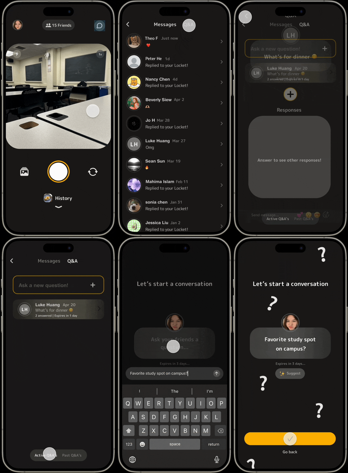
Asking a question
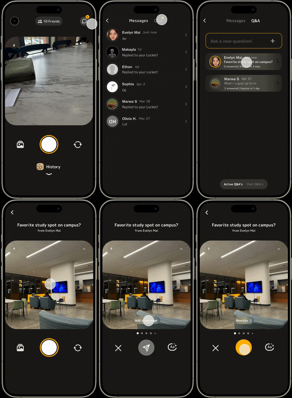
Answering a question
What’s wrong with Locket?
After interviewing multiple Locket users, I was able to gather some insights:
1. Users find value in staying connected with their friends’ activities and updates on Locket.
2. Users think of Locket as a low-pressure social media environment to post on.
However, I also found a not-so-positive insight:
Users primarily passively engage with their friends rather than actively communicating or building deeper connections, which led me to a realization.
Locket Facilities Passive, Not Active Interactions
Although Locket is great at allowing users to easily share candid photos to maintain connections with their friends, this ease causes users to start posting meaningless content and eventually discourages users from posting on Locket. My goal for my user research was to dive deeper into this theory.
I interviewed 5 Locket users and found some positive trends:
“Reaching out actively takes too much energy out of me.”
- LH
“Sometimes I get messages but I don’t see them and when I click into them a few days later, I feel bad.”
- JL
From my research, I was able to add to my original hypothesis and define a people problem:
When users share photos and videos with their friends on Locket, they want to maintain deep connections with them but are unable to because:
It’s difficult to have more meaningful interactions with friends beyond reacting to photos.
The app’s environment makes it easy to share casual and “meaningless” content, discouraging users from spending quality time on the app.
I recruited my friends Theo and Sean to help me brainstorm a possible solution. To frame our exercise, I simplified our people problem:
How can we maintain meaningful connections with friends through photos and videos on Locket?
We came up with three Solution Spaces: Dailies, Friendly Competition, and Interaction with Friends. After 2 hours, we came up with six possible solutions, two from each solution space.
1. Interaction with Friends:
Q&A feature where users can ask questions and friends can respond with a photo
Comments section with custom stickers, emojis, gifs, and reactions
2. Dailies:
Daily prompts that encourage users to post a photo for that day
Locket Streaks
3. Friendly Competition:
Leaderboard for most photos posted, most time spent on the app, most messages sent, etc.
A points incentive where certain actions give you points to unlock new features
After completing a thorough analysis of the strengths, weaknesses, opportunities, and threats of each of the possible solutions and comparing the feasibility and impact of each solution, I settled on bringing the Q&A feature to life since it most effectively addressed my people problem.
Brainstorming Possible Solutions 🧠
What’s the answer to this problem?
SWOT Analysis of Six Solutions
Designing the Solution
Exploring the Q&A Feature❓ 🙋
The Q&A feature promotes a new type of interaction, which is the back and forth that occurs from asking and answering questions in a separate section dedicated to various threads.
Since prompts were another feature that was feasible and had a high impact, I decided to merge the two. Users can choose to either write prompts or generate prompts to start a Q&A thread. The Locket Streaks feature was a close third, but I felt that the Q&A feature was better because streaks don’t necessarily increase meaningful interactions, in fact, they could do the opposite, which defeats my people problem.
The app’s content would also be more meaningful since the feature forces users to think about their answers to the prompt before responding. The prompts can change every day, encouraging users to keep coming back and spending quality time on the app — something the other features don’t necessarily do.
I created some Low Fidelity User Flows that addressed every possible interaction with the Q&A feature.
4 Possible User Flows
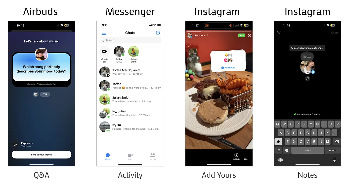
I decided to do some feature audits from other apps and platforms that have similar features. I took some inspiration from Airbuds’ overall structure, Messenger’s layout for the top section above the DM’s, and Instagram’s photo & text interactions. Doing market research helped me establish a framework for creating intuitive, user-centered design.
Now that I had some visual design inspiration, I had to figure out where the feature itself would sit in the app and how to organize each piece of content to make the Q&A functional. I created an Information Architecture Diagram to help me arrange these puzzle pieces.
I decided to put the Q&A feature on the same hierarchy plane as the messages feature because doing so would distinguish the feature from Locket’s main camera/home screen and give the feature room to function, as well as be in a convenient place for users to access.
Since messages are another form of main interaction that I aim to promote on the app, having the Q&A feature in the same area would force users to open the inbox to look at both their messages and active/past Q&A’s.
Low Fidelity User Flows (Asking a question)
Creating a Medium-Fidelity Prototype 💻
The 3 I’s: Inspiration, Ideation, & Iteration
Feasibility & Impact Matrix
Medium Fidelity User Flows
Iterating Flow 1 🤔
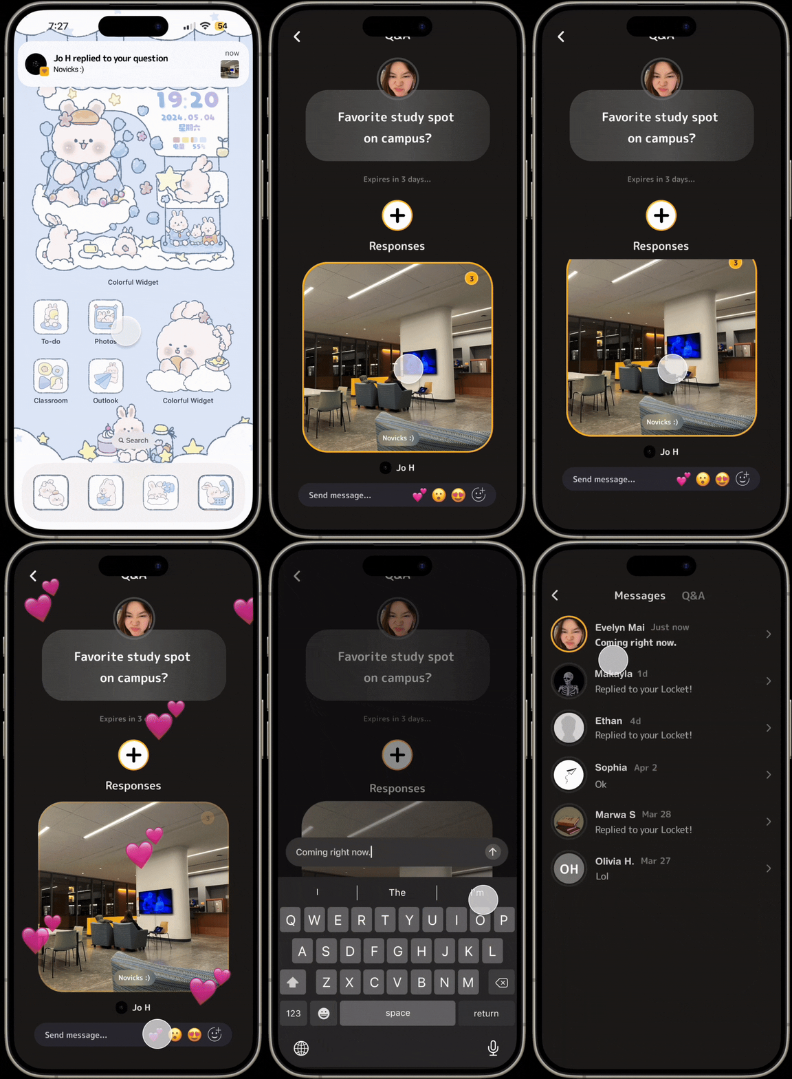
Replying to an answer
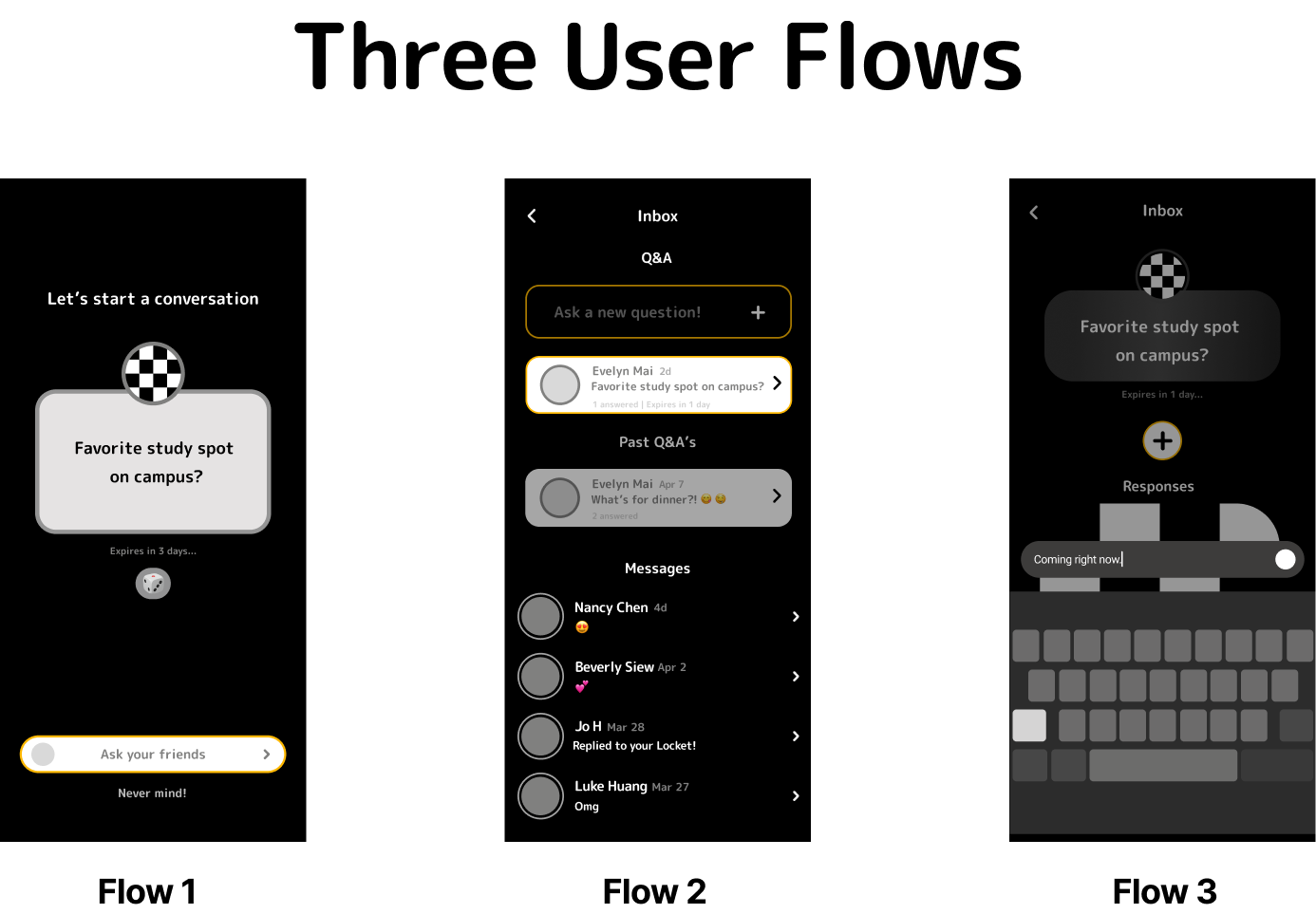
I narrowed down my designs to three user flows.
1. A user starts a new Q&A thread (asks a question)
2. The user’s friend replies to their question
3. The user replies to their friend’s answer
Based on the information hierarchy, I wanted the entry point to the Q&A feature to be in the same area as the messages feature.
These 3 iterations show what users see after clicking the entry point and display the entry point to the Q&A feature. After having many conversations with my TA (teaching assistant) and further reflecting, I settled on exploration C because it separates the messages and Q&A, giving the Q&A feature room for clear organization.
After deciding on where to put the Q&A feature, I had to next figure out how to separate the active and past Q&A’s. Having a past Q&A section would let users look back on expired threads, which is important since Locket values memories. One of Locket’s key features is its monthly recap that shows a 30 second clip of every single Locket you sent and received that month. You are also able to see every Locket you have ever sent in your history.
Version A was suggested by my TA, similar to BeReal. I liked this version because it shows the user what the possible options are, as opposed to version B’s dropdown icon next to the Q&A tab, which is too vague and hides information. Version C is a bit more intuitive than version B, but would require more steps to reach the past Q&A’s from the active Q&A’s since you would need to click the drop-down and then select past Q&A’s. That’s two steps as opposed to one step with version A’s tab toggle design.
Next, I played around with the design for creating a new Q&A thread. Version E matches Locket’s current UI the most, so I decided to move forward with this exploration. I also included a button underneath “Ask your friends” for users to go back to the Q&A if they decide they don’t want to create a new thread anymore compared to version D.
I repeated this process with the rest of the user flows, and soon had 3 completed medium-fidelity flows.
User Testing & Iteration
Are my designs really intuitive enough?
Some visual design inspiration ✨
I created a high-fidelity prototype of each user flow, and put my feature to the test!
At the end of testing, I wanted to figure out:
Can users easily view a Q&A thread?
Can users easily respond to a thread?
Can users easily post to a thread?
How do users interact within a Q&A thread?
Can users use the feature without any difficulties
After interviewing users around me, I noticed 3 main trends.
Trend 1: Users mostly clicked on other buttons before clicking on the message button
Insight 1: Users weren’t sure where the Q&A feature was embedded
To solve the first issue of not knowing where the Q&A feature was embedded, I added notifications to inform users of any potential updates from the Q&A feature such as if a new thread was created by one of their friends or if one of the user’s threads received a reply.
Trend 2: Users did not use the dice feature to generate a prompt
Insight 2: Users did not know what the dice button did and therefore did not interact with it
Since the dice button’s affordances were unclear to the user, the user did not interact with it. To change this, I added text next to the icon and changed the icon from a dice emoji to a sparkle emoji to mimic the icon design of AI software like Google’s AI Gemini. “Suggest” sounded more inviting than “Generate”, so I went with “Suggest.”
Trend 3: Users did not click on the newest thread when trying to open up a Q&A
Insight 3: Users do not know the difference between a read V.S. unread thread
The next challenge was defining whether or not a thread had already been opened before by the user. During the usability test, I observed that when tasked to reply to the most recent thread, some users would click on an active thread, but not the newest active thread. I was inspired by Instagram’s DM’s (bolding text) and Locket’s UI (gold ring around the profile picture) and added these details to other areas of the feature.
Now that I had notifications and a way to define an unread thread, I worked on combining both to give users more information about the number of replies on a thread. This design mimics Locket’s design when you click into the widget and swipe through new Lockets on your feed.
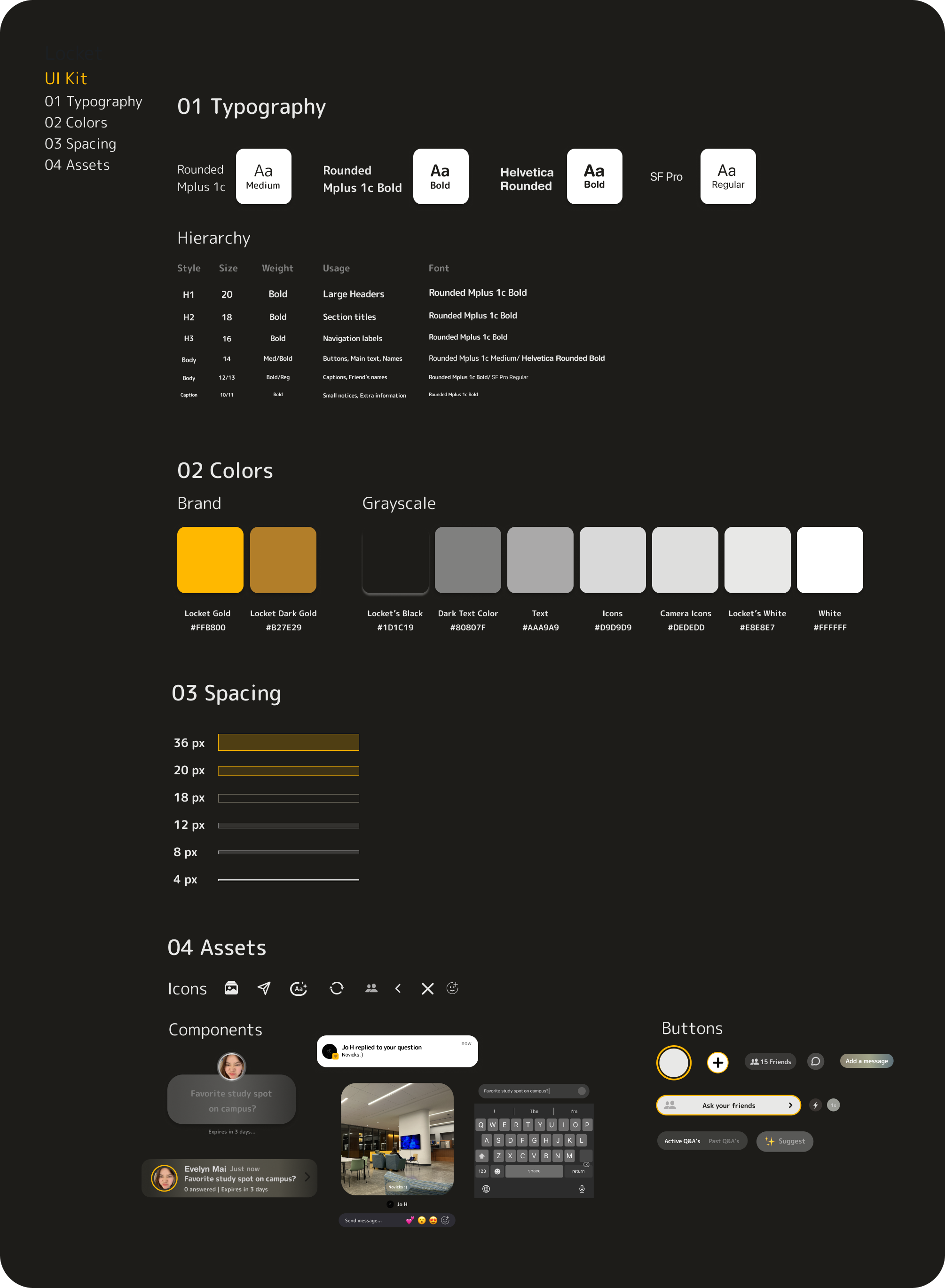
My Design Kit
Built with love
Conclusion
What I Learned from My First Case Study
If I had to describe my experience going through all the stages of the design process for the first time, I would say it’s difficult but highly rewarding.
Some stages took a lot longer than I anticipated and the overall process required a lot of writing, ideating, and iterating. I learned a lot throughout the whole experience, from conducting UX research to sketching wireframes to building out a high-fidelity prototype.
The most important thing I learned throughout this journey, however, is that designing can be an unpredictable, messy, iterative process, but that’s the beauty of it. You try out new things, realize they don’t work, appreciate the moments that do, and grow from the experience.
Why You Should Download Locket
“Long term, we want Locket to be the best way to feel closer to your friends and family”
— Matt Moss, CEO of Locket
Locket is one of my favorite apps, but it’s highly underrated, which Is why I wanted to do a case study on it. I downloaded Locket around 2 years ago when I was in high school. During its earlier stages of development, we were only allowed to add up to 10 friends and had access to very basic features.
Over the years, the app has grown in popularity and evolved significantly. Locket is still an almost daily part of my life and has helped me stay connected with my closest friends, especially since moving away to college. I’m able to stay in touch with my home friends who are all attending different schools in different states, and It feels heartwarming to see casual snippets of their day on my home screen. It’s a nice way to stay in touch and I’m so thankful for Locket!
If I had more time, I would like to explore ways to gamify the Locket experience and improve user retention. Adding stickers, more captions, filters, and other areas for personalization could be an interesting space to play around with and explore. I know Locket is an app for close friends, but I hope there could be a feature in the future that involves community building such as being able to send Lockets to groups.
Hopefully, you get inspired by this case study and download the app for yourself :)

